A Thousand Futures: Monte Carlo Risk for a Solar Project
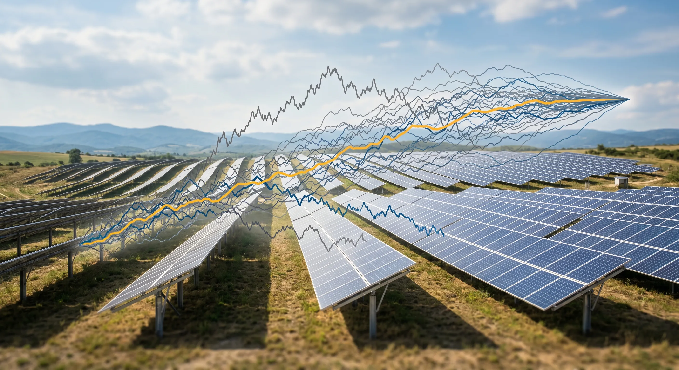
Project Finance, in Python, a three-part series. Part 1 · What a Solar Farm Is Worth · Part 2 · How Much Sun? · Part 3 · A Thousand Futures (this post)
This is where the series pays off. In Part 1 I built a project finance model for a solar plant that produced a single equity IRR of about 7.7%. In Part 2 I argued that a single number is a comforting lie (the future isn’t one line) and built a dataset describing how sunlight really behaves.
Now I’ll connect them. The plan is to learn a probabilistic model of the two things that drive the plant’s revenue (the weather and the electricity price), simulate a thousand different 30-year futures, and run every single one through the project finance model. Out the other end comes not an IRR, but the distribution of the IRR: the expected return and the shape of the downside. That distribution turns out to tell a far more honest (and more unsettling) story than the lone 7.7% ever could.
flowchart LR
  A["1 · Historical data"] --> B["2 · Fit stochastic models"]
  B --> C["3 · Simulate 1,000 futures"]
  C --> D["4 · Project finance model ×1,000"]
  D --> E(["5 · Distribution of IRR"])
Real data → fitted probabilistic models → a thousand simulated futures → a thousand full model solves → one distribution.
This is Monte Carlo simulation: when a system is too tangled to solve with a formula, you don’t try, you just play it out thousands of times with realistic random inputs and look at the spread of outcomes. The art is entirely in making the random inputs realistic. So before any simulation, two models.
Modelling the weather: a chain with memory
In Part 2 the daily Clear-Sky Index (CSI) showed two features any honest model has to reproduce: a skewed shape (most days near-perfect, a thin tail of bad ones) and memory (cloudy days cluster). A model that nailed the shape but ignored the memory would scatter bad days evenly and badly understate the risk of a rotten month.
The tool for memory is a Markov chain: a system that hops between a handful of states, where tomorrow’s state depends only on today’s. I bucket the continuous CSI into three weather regimes, overcast (CSI 0–0.6), intermediate (0.6–0.9) and clear (0.9–1.0), then count, across eleven years, how often each regime is followed by each other. Those counts, normalised, give the transition matrix , where is the probability tomorrow lands in regime given today is in regime :
stateDiagram-v2
  Overcast --> Overcast: 35%
  Overcast --> Intermediate: 46%
  Overcast --> Clear: 18%
  Intermediate --> Overcast: 23%
  Intermediate --> Intermediate: 41%
  Intermediate --> Clear: 36%
  Clear --> Overcast: 5%
  Clear --> Intermediate: 17%
  Clear --> Clear: 78%
The fitted chain. Each arrow is a real transition probability counted from 11 years of days.
The story is in the self-loops. A clear day is followed by another clear day 78% of the time; the chain wants to stay where it is. That self-reinforcing tendency is the mathematical fingerprint of weather persistence, exactly the clustering I was worried about losing.
The chain gives me which regime each day is in, but not the precise CSI value. For that, within each regime I fit a Beta distribution (the natural choice for a quantity bounded on [0, 1]) to the historical days in that bucket. Simulating a future then has two layers: walk the chain to get a sequence of regimes (with the right persistence), then draw each day’s actual CSI from that regime’s Beta (with the right shape). The full fitting and sampling code is in the notebooks.
Does it work? The acid test is to simulate a thousand new histories and check that their CSI distribution matches the real one it was never explicitly told to copy:
The synthetic weather (orange outline) sits right on top of the eleven-year history (blue). The model has learned the climate.
Modelling the price: and an uncomfortable surprise
Revenue is energy times price, and the merchant price is its own random beast. Rather than assume a shape for it, I used a kernel density estimate (KDE), a non-parametric method that, in effect, lays a small smooth bump on top of every historical data point and adds them up, letting the data draw its own distribution. I fed it Spanish day-ahead prices, but cleaned deliberately: only sunny hours (07:00–17:00, since that’s when a solar plant earns), and only 2024 onward (to exclude both the 2022 energy-crisis spike and the abnormally low pre-COVID years, neither of which represents the future). Here is that cleaned series, the average midday price on every day since 2024:
Then I plotted what the plant actually captures, and this is the most important chart in the entire series:
In Part 1 I assumed a flat €40/MWh merchant price, already on the conservative side. But a single flat number hides everything that matters. The reality of midday Spanish power is messier than any average can convey: a median of about €28/MWh, a fat spike near zero, and a meaningful number of days where the price goes negative, producers paying to offload power.
This is solar cannibalisation, and it’s the defining economic risk of the technology. Every solar plant in a region produces at the same time (when the sun is up) and floods the midday market with near-zero-marginal-cost electricity. The very abundance that makes the resource attractive crushes the price of selling it. The sun, it turns out, was never the thing to worry about. The price of selling sunshine is.
And, just as with the weather, a quick acid test that the KDE reproduces the price distribution it was fitted to, with synthetic draws laid right over the real history:
A thousand futures, through the model
With both engines built, the simulation is mechanical. Generate 1,000 paths, each a 30-year daily sequence of CSI (Markov + Beta) and price (KDE). For each path, multiply the deterministic clear-sky backbone by the simulated CSI to get actual irradiance, then convert that into the net equivalent hours the finance model wants, using two standard PV engineering factors, a transposition factor (1.3, the gain from tilting panels toward the sun) and a performance ratio (0.8, real-world system losses):
The only change to the Part 1 model is that two scalar inputs (resource and merchant price) become arrays, one value per year, so each simulated future feeds its own weather and prices into the cash-flow waterfall. Then I solve the full circular model a thousand times. Each of those runs is a complete project finance model (sized debt, sculpted repayments, the circular interest loop, the lot), just like Part 1. A thousand IRRs come out.
The payoff: a distribution, not a point
This is what the whole pipeline was built to produce, and it lets me make a statement no single-point model can: the expected equity IRR is about 8.5%, almost all outcomes fall between 8.1% and 9.0%, and the worst 10% of futures come in below roughly 8.3%. The centre is the expected return; the left tail is the quantified downside, precisely the language a lender or an investment committee needs, instead of a lone optimistic number.
What a projet like this really cares about to asses risk are the P50, P90 and P99 values. A P90 is the return beaten in 90% of futures, i.e. a downside figure, not an average, the distribution reads:
| Exceedance level | Equity IRR |
|---|---|
| P50 (median) | 8.5% |
| P90 | 8.3% |
| P99 | 8.0% |
Even the 1-in-100 downside (P99) only gives back about half a point of IRR. That tightness is itself the second finding.
Two findings jump out, and both are the kind of thing the deterministic model could never have told me.
First: the expected return lands a touch above Part 1’s headline, and the reason should make you nervous, not relieved. The simulated site sees almost exactly the same sunshine as the Part 1 base case (around 1,820 equivalent hours a year versus 1,800), so the resource isn’t what’s moving the answer. The price is, but not in the direction you’d guess. The realistic captured price averages about €42/MWh, marginally above Part 1’s flat €40 assumption, which is enough to nudge the expected IRR from 7.7% up to ~8.5%. (Solve the deterministic model at the simulated mean inputs, ~1,820 hours and €42, and it returns 8.5% on the nose; the Monte Carlo centre is no mystery.) But that comfortable €42 average is a mirage of central tendency. The median captured price is just ~€28/MWh: half of all days earn that or less, and the average is hauled up by a thin tail of high-scarcity-price days. The flat €40 wasn’t wrong about the mean, it was blind to the shape, and the shape is the entire risk story (more on that below).
Second: the distribution is astonishingly tight. A spread of barely ±0.4 percentage points across a thousand futures is far narrower than people expect from “weather risk”. Why so calm?
Because of diversification across time. A solar plant doesn’t live or die by one year, it averages weather over 25 of them. A single cloudy month barely moves a 25-year IRR, and at a consistently sunny site there isn’t much year-to-year resource variance to begin with. Annual weather noise, played out over the asset’s life, largely averages away, the law of large numbers, doing its quiet work. The scatter makes it visible: across all thousand futures the lifetime-average sunshine (x) and captured price (y) sit in a tight little cluster, and the equity IRR (the colour) holds in a narrow 8–9% band throughout. The faint gradient that remains runs along the resource axis, not the price one, the last sliver of weather noise that didn’t quite average away. The price risk that actually matters isn’t visible here at all: it’s the structural price level this stationary model holds fixed, which is the whole point of the next paragraph.
The real conclusion is a shift in where the risk lives. For this asset, year-to-year weather is not the thing that keeps you up at night, it diversifies out. The dominant risks are the ones this model holds fixed: the structural price level (that cannibalisation curve drifting lower as more solar is built), the cost of debt, and the terms of the next PPA. A good risk model doesn’t just give you a number with error bars; it tells you which uncertainties actually matter, and here it points firmly away from the weather and toward the market.
What the three numbers taught me
The series walked one project finance model through three levels of honesty. Part 1 said “the IRR is 7.7%”, a clean point estimate that, it turns out, was roughly right on average but utterly silent about the risk around it. Part 2 measured the real world the model was pretending to know. Part 3 replaced the point with a thousand data-grounded futures and produced “the IRR is centred near 8.5%, it’s remarkably stable to weather, and the thing that should actually worry you is the price of midday power, whose comfortable €42 average hides a €28 median and a tail that cannibalisation will keep thinning.”
That last sentence is worth more than the first, even though it’s less comfortable, because it’s the difference between a number and an understanding of the risk behind it. Building the machine that gets you there (the cash-flow waterfall, the Markov weather, the Monte Carlo engine) is, to me, where engineering and finance turn out to be the same discipline wearing different clothes.
Notes, assumptions & further work
Key assumptions. Daily CSI modelled as a 3-state Markov chain with a per-state Beta distribution; daily merchant price drawn from a Gaussian KDE fitted to Spanish day-ahead prices (sunny hours, 2024 onward); 1,000 independent simulations over a 30-year horizon; annual GHI converted to equivalent hours with a transposition factor of 1.3 and a performance ratio of 0.8; all other inputs (capex, opex, debt terms, PPA) held at the Part 1 base case.
Simplifications. The biggest one: weather and price are simulated independently, when in reality they are correlated, solar gluts depress midday prices (the cannibalisation effect is itself resource-driven), and weather affects demand. The price distribution is stationary, it does not decline over 30 years as more solar is built, nor follow a forward curve, nor inflate. Daily prices are drawn i.i.d. (no autocorrelation or mean-reversion). Negative prices are clipped but the plant is not modelled as curtailing when prices turn negative. Three weather states is deliberately coarse, and only the resource and price vary across simulations, every other model input is fixed.
Where it could go further. Model the price–resource correlation and an explicit capture rate; make the price non-stationary (a declining solar-capture scenario, or a forward-curve-anchored path); add curtailment and negative-price shutdown logic to the revenue line; stochastic interest rates and inflation; a richer weather model (more states or a continuous autoregressive process); a correlated multi-asset portfolio; and sensitivity of the IRR distribution to the KDE bandwidth and the number of Markov states. The headline caveat stands: the tight distribution reflects these assumptions; widen the price model and the spread widens with it.
All three models and notebooks are on GitHub. This is a personal modelling exercise, not investment advice, assumptions and data cuts are illustrative.
Last modified: 17 Jun 2026